
How Not To Be Overwhelmed By Different Data Sources
Dashboards to the Rescue
Finding clarity can feel impossible in a world overflowing with data—but it doesn’t have to. From marketing analytics platforms and CRM tools to spreadsheets and financial reports, juggling these systems often leads to confusion, inefficiencies, and missed opportunities. You’re not alone if you’ve ever felt lost in a sea of numbers and charts, you’re not alone. Fortunately, dashboards are here to simplify the chaos.
In this article, we’ll explore how dashboards improve data management, highlight practical benefits, and guide you in selecting the best solutions.
Too Many Data Sources, Too Little Clarity
Consider the following situation: Every department in your company uses a different tool to monitor its performance. The sales team relies on CRM software, the marketing team uses analytics dashboards, the finance department has detailed spreadsheets, and operations depend on yet another platform for workflow management. You must juggle multiple systems, logins, and reports to get a complete picture of your organization’s performance.
This scattered approach often leads to the following:
- Data Silos: Important insights are trapped within specific departments or tools.
- Time Wasted: Hours are spent compiling and comparing data from different sources.
- Decision Paralysis: Without a clear and cohesive view, it’s hard to make informed choices.
- Human Errors: Manually aggregating data increases the likelihood of mistakes.
So, how do you cut through the chaos? Enter dashboards.
What Are Dashboards and Why Are They Important?
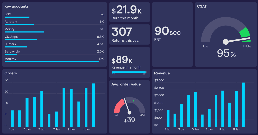
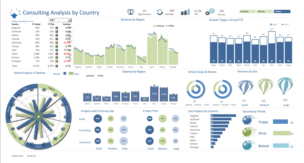
A dashboard is a visual representation of key data, consolidated in one place. Think of it as a command center for your information. Instead of jumping between platforms, a dashboard brings all your critical data together, making it accessible, digestible, and actionable. Learn more about a dashboard and why it’s a game-changer for data management.
Key Benefits of Dashboards:
- Centralized Data: No more logging into multiple platforms. A dashboard integrates data from different sources into one cohesive view.
- Real-Time Insights: Dashboards can pull live data, ensuring you always work with up-to-date information.
- Customizable Views: Tailor dashboards to focus on metrics that matter most to your goals.
- Improved Decision-Making: Clear visuals and trends make it easier to identify opportunities and challenges.
- Time Efficiency: Spend less time collecting data and more time analyzing it.
How Dashboards Work
A dashboard connects to your data sources and converts raw numbers into easy-to-understand visualizations such as charts, graphs, and tables. Here’s how it works:
- Data Integration: Dashboards connect with tools like Google Analytics, Salesforce, Excel, or even databases to pull in data.
- Visualization: They display data in intuitive formats that highlight patterns and trends.
- Custom Metrics: You can choose what to track, from sales revenue to website traffic.
- Automated Updates: Dashboards refresh automatically, ensuring your data is always current.
Choosing the Right Dashboard Tool
Not all dashboards are created equal. Here are popular tools and their best use cases:
- Tableau: Ideal for advanced analytics and data visualization.
- Power BI: Great for businesses using Microsoft products.
- Google Data Studio: Perfect for marketers and free to use.
- Looker: Excellent for large-scale data analysis and integration.
I’d recommend you try tools with free trials to find the one that fits your goals, technical skills, and budget.
Steps to Create an Effective Dashboard
Ready to set up your first dashboard? Follow these steps:
1. Identify Your Goals: What do you want the dashboard to achieve? Define clear objectives.
2. Select Key Metrics: Focus on the most relevant data points. Too much information can clutter your dashboard.
3. Choose a Tool: Pick a dashboard platform that aligns with your technical skills and needs.
4. Integrate Data Sources: Connect your tools and platforms to the dashboard.
5. Design for Clarity: Use clean layouts, logical groupings, and color coding to make the dashboard easy to read.
6. Test and Refine: Share the dashboard with stakeholders, gather feedback, and make improvements.
FAQs About Dashboards
Q1: What types of data can a dashboard integrate?
Dashboards can be pulled from virtually any source, including cloud applications, databases, spreadsheets, APIs, and more.
Q2: Are dashboards only for large businesses?
Not at all! Dashboards are valuable for individuals, startups, non-profits, and enterprises alike.
Q3: Can dashboards be tailored for specific roles?
Yes. For example:
– CEOs can monitor overall performance.
– Marketers can focus on campaign metrics.
– Financial analysts can track cash flow and expenses.
Dashboards to the Rescue
In an era of information overload, dashboards provide clarity, save time, and empower better decisions. Whether you’re a solopreneur tracking social media metrics or a business leader monitoring company performance, dashboards can transform your data use.
Your data holds the answers you need. Start small, explore dashboard tools, and unlock efficiency and growth—because the clarity you’ve been seeking is just a dashboard away.
Ready to simplify your data? Try Google Data Studio for free or schedule a consultation to design your first dashboard!
